
One of the few times I've been successful with such a lesson is in studying pay inequality between men and women in the U.S.A. I've done this lesson in both Algebra 1 and Algebra 2. I think the older students are better able to delve into the underlying factors (not surprising).
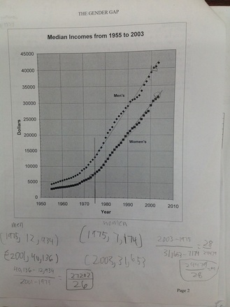
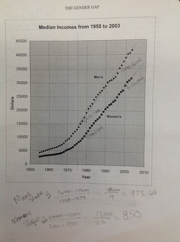
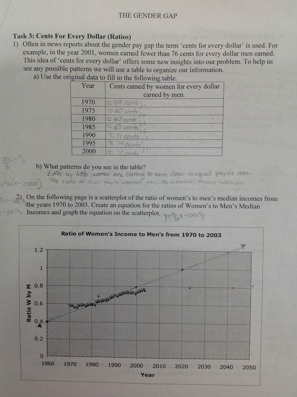
Then we look for trends in the tables. Almost always students say that men earn more than women and that as the years increase people make more. Then we see if the graphs can help us be more specific (page 2 of the doc). What do you see? Can you use math to describe that? Students suggest exponential curves. We try them and they don't work. Then we talk about cutting off parts of the data. If you cut the data at 1975-ish, it becomes approximately linear.
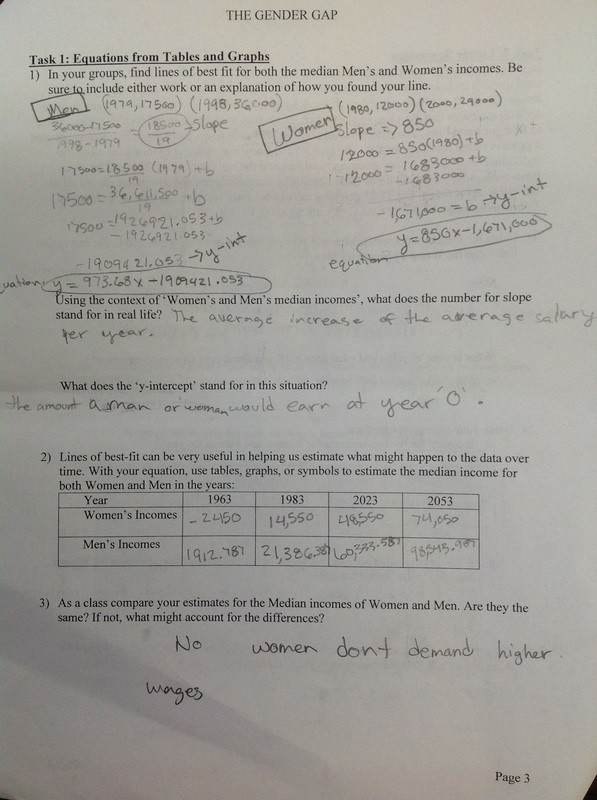
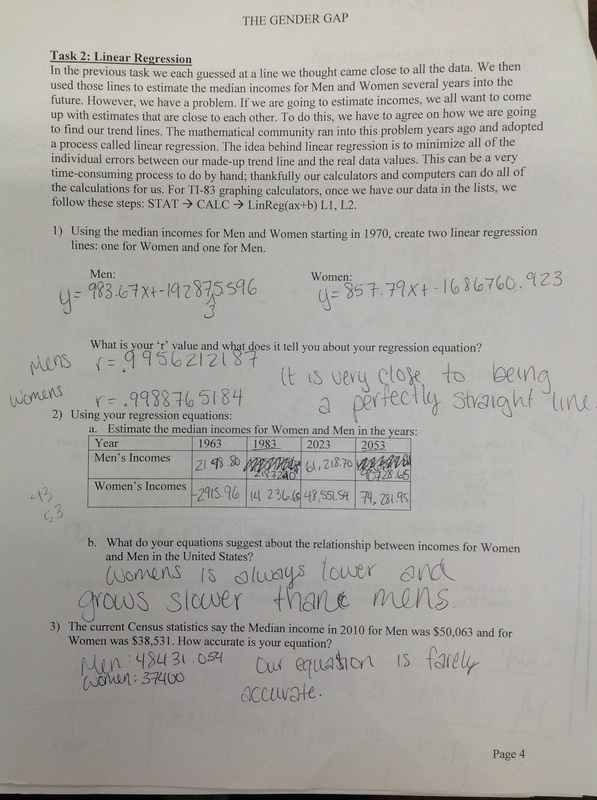
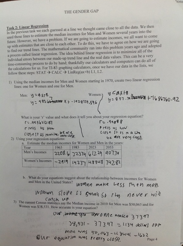
In Task 1 students find equations for both men and women incomes using lines of best fit and two points. Students must also explain what each aspect of the function stands for and whether it is appropriate to predict backwards using the functions.
| MS Word file of the lesson
| MS Excel file with data for student calculators
| ||||
 RSS Feed


